That is a lot of money.
So when creating a logo it has to be good from the start.
When I ask you which logos come to mind I’m
How come those logos
One of those reasons is that
1. Inspiration

Luckily for you you’re not the first person to create a logo! Many others have done it before you and
But don’t give up.
Your logo is something you need to think about, get inspired and that you need to brainstorm about.
Understand which voice you want to use as a business and reflect that via the style of your logo.
2. Specificity

In the initial stage you’re preparing for a logo and that includes research. Research however doesn’t mean to copy a logo and hope
3. Colors – Font Type
Choosing the right color or colors is
On the one hand, it should not resemble your competitors and on the other you should be able to deliver your message.
For example: if you sell baby clothing, then baby blue or baby pink might fit. If you deal with growth or environmental subjects, then green is a better fit.
What you have to keep in mind is that colors have an emotional effect, you tap into the psychology of people. Blue provides confidence, while purple emits elegance and red
We have created a comprehensive guide for you to pick the right color
The font is just as important. It will also determine
4. Name

Creating a name can be
How do you solve it?
Teamwork! Gather 2-3 people and start brainstorming. Don’t shoot down any idea and just collect all the creativity. At a point you will have a spark that fits your business identity.
Keep the name short. Try words relating to pleasant memories and jot them all down.
Found a great wordplay? Excellent!
Do other people understand it as well? If not, then continue.
It will take some time before you have found that specific name, just be patient, leave room for creativity, search synonyms and you will deliver.
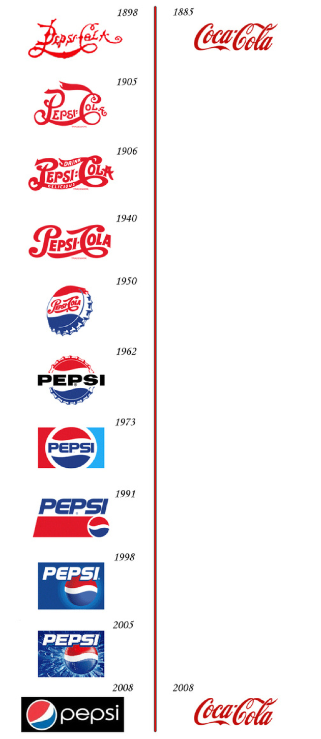
5. Hypes Fade, Trends Change
Maybe you have picked up new trendy words like YOLO or Insta-Food and want to use those for your brand.
But hypes die out and that will make you less relevant.
And most likely you’re building a business to last, right? Create one that lasts and don’t be like Pepsi:

6. You Might Need Help

Are you good at drawing yourself?
Great!
But it’s better to keep this a hobby and get professional help from a designer.
If you’re serious about your business and your brand identity, it’s better to leave it to an expert. Contact a graphic designer and collect the ideas from your brainstorming and inform which colors you would like.
They will do the rest.
7. Selecting the Logo Type
Wait, there is more?
Yes. We have several logo types to choose from. Let’s collect them for you:
Letters: some businesses use logos
Symbols: Symbols play an important role in logos. Fo
Often symbols from local culture or history
Abstract: Abstract
Word mark: a word mark is a logo made of a word, turned into a logo. Example? Google or Coca-Cola.
Choosing the right logo is only as difficult as you want it to be. Often simplicity wins. Use the above inspiration to have a logo created or if you’re a designer yourself, you know what to do.
You might also like:
- How To Write Engaging Content For Your Website
- How To Bring
Customers Back Into Your Business - The Psychology of Colour in Marketing
- Promoting Yourself Online: 9 Ways To
Actually Deliver - The Buying Cycle Explained (And Why
You Should Know )